Same vision, refreshed appearance
A few key feelings brought us to embark on this recent branding refresh: we wanted to ensure that our brand appearance is right for a digitally minded company, we needed to create more cohesion between the different areas and companies which form DSD, and we felt it was time to modernize our main brand logo.
Our updated appearance represents the DSD vision and approach to dentistry – read on to find out everything you need to know about our new branding.
There were three main aspects to our brand refresh: update our main DSD logo, define our brand hierarchy and refresh our colors.
The DSD logo
What’s new?
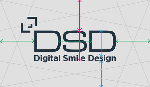
- We have maintained the original brandmark ‘DSD’; this has become iconic and it was important to us for this to be retained from the previous logo.
- We have updated the font from Turkish to Gotham. This new font is easier to read, better for digital and more suited to different screen sizes.
- We have added the eye-catching DSD emoji from our patient brand, creating cohesion. This is an evolution of the face-mapping icon.
How does it work?
DSD is a strong community with passionate followers and a valuable brand. We needed to create a hierarchy to protect our brand and the quality it represents, make it clear to people which section of the business they are dealing with, and give our community the tools to be able to use our logo correctly.
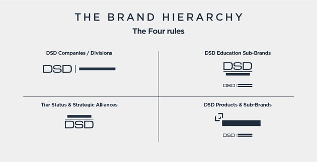
The brand hierarchy is broken down into four sections.
- DSD Companies and Divisions: reserved for legal entities or departments. DSD on the left, the company or division on the right.
- DSD Education sub brands: DSD on the top, the name of the sub brand below.
- Tier Status and Strategic Alliances: DSD on the bottom, with the status on top.
- DSD Products and Sub brands: the DSD emoji with the product and the associated company.
Our colors
The science behind our choices
We wanted to have a color story, a color language – we are a very creative company, known for our marketing and storytelling. It’s not enough to tell with words and pictures; we need to use color.
We also want it to be clear and easy for people to understand which part of DSD they are dealing with.
“We have picked luxurious dark navy, deep, rich accent colors, and muted, cool greys to lead the main brand as this needs to be as neutral as possible. High-quality photography and flashes of accent colors will push the branding forward” Dan Toomes, Creative Director.
The main brand:
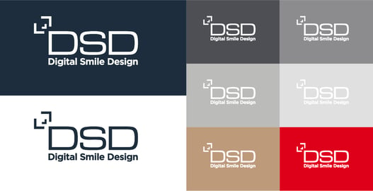
- We replaced the color black with ‘DT Vought’. This is a subtle but significant change which differentiates our brand: an off-black shade alters how your eye interacts with the text or icon and has a softer look with less contrast. This change gives us an edge of visual uniqueness and elegance and the color navy also has connotations of esteem, trust and knowledge.

- Our secondary colors are several shades of cool grey, contributing to keeping the main brand neutral.
- Our rich accent colors have a luxury feel. First is the tone of ‘Champagne Gold’, then the warm ‘Coachman Red’ in comparison to the previous, more orange tone.
DSD Companies and Divisions:
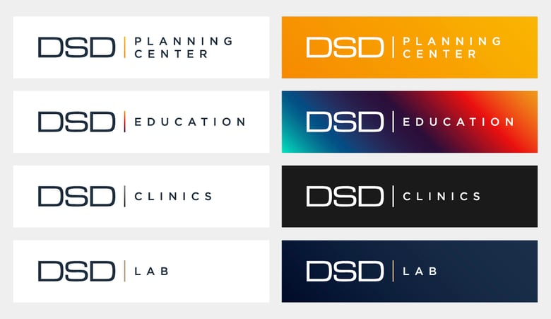
DSD Planning Center: the Planning Center is represented by shades of mustard gold and dark grey.
DSD Education: the gradient of colors represents the global aspect of DSD Education: we are privileged to help dentists around the world become even better at what they do.
DSD Clinics: our DSD Clinics maintain their traditional use of black.
DSD Lab: the DSD Lab is recognizable by shades of navy blue with luxurious champagne gold.
We are proud to have the opportunity to present our brand refresh to you and hope you are as impressed with our new look as we are! If you have any questions about the new guidelines for DSD logos, please don’t hesitate to get in touch. We’ll be happy to explain the changes in more detail and give you some guidance on how to use them.
To stay up to date with all the news from DSD, make sure to keep an eye on our website and our blog.
A year of growing the DSD Clinic community

.jpg?width=1280&name=Blog%20Featured%20Image-100%20(3).jpg)
.jpg?width=635&name=Blog%20Featured%20Image%20copy-100%20(2).jpg)
